
Introduction
The recent publication of the Web Content Accessibility Guidelines (WCAG) 2.2 as a W3C Recommendation establishes a new, higher benchmark for digital inclusion. This phased methodology, "Beyond Compliance," provides an enterprise-ready framework for implementing WCAG 2.2 Level AA. Adopting this standard is not merely a technical task but a strategic business imperative that minimises legal risk, enhances brand reputation, expands market reach to the over 1.3 billion people with disabilities, and improves SEO.
This guide details a four-phase approach to embed accessibility throughout the project lifecycle, ensuring conformance is a continuous practice rather than a final audit.
- Phase 1: Discovery: Establishes accessibility as a core project requirement by creating inclusive user personas and defining WCAG 2.2 AA as the clear success metric.
- Phase 2: Design: Focuses on creating an inherently accessible user experience by addressing colour contrast, target sizes, and accessible navigation, with a specific focus on the new WCAG 2.2 criteria.
- Phase 3: Development: Translates the design into robust, semantic HTML, ensuring full keyboard operability and functionality with assistive technologies.
- Phase 4: Monitoring: Implements a hybrid testing strategy, combining automated scans with essential manual and assistive technology testing to maintain conformance over time and close the loop with an accessibility statement and user feedback channels.
By integrating this methodology, your organisation can move beyond compliance to build a resilient, future-proof, and truly user-centric digital presence.
This new standard does not replace previous versions but extends them; content conforming to WCAG 2.2 is also backwards-compatible with WCAG 2.1 and 2.0. The update introduces nine new success criteria and removes one (SC 4.1.1 Parsing, which is now obsolete due to advances in browser error-handling).
The imperative to adopt WCAG 2.2 extends beyond technical compliance. Ethically, digital accessibility is a moral responsibility to ensure equal access for the over 1.3 billion people globally living with some form of disability. Legally, WCAG 2.2 Level AA is solidifying its position as the de facto benchmark for demonstrating compliance with non-discrimination laws, such as the UK's Equality Act 2010, and is the mandated standard for UK public sector bodies Businesses that adopt this standard are not only minimising legal risk but are also enhancing their brand, extending their market reach, and measurably improving Search Engine Optimisation (SEO) through better-structured content and user experience (UX) signals. The nine new criteria are not arbitrary additions. They are a direct response to previously underserved user needs, with a strong focus on enhancing accessibility for users with cognitive or learning disabilities, low vision, and motor disabilities, particularly on mobile and touch-screen devices.
Achieving conformance requires more than a final-stage audit. It demands that accessibility be embedded into the entire project lifecycle, from conception to long-term maintenance. This methodology is structured around the four foundational principles of accessibility—that content must be Perceivable, Operable, Understandable, and Robust (POUR) and organised into four distinct implementation phases: Discovery, Design, Development, and Monitoring.
Phase 1: Discovery and Strategic Planning

Real-World Issues: The Domino's Supreme Court Case
For years, the Domino's Pizza website and mobile app were inaccessible to blind users who rely on screen reader software. A blind man, Guillermo Robles, sued Domino's for being unable to order a pizza, arguing that the company's failure to accommodate him violated the Americans with Disabilities Act (ADA).
The case went all the way to the Supreme Court. In 2019, the Court declined to hear Domino's appeal, which meant the lower court's ruling stood: the lawsuit could proceed. The core issue was simple: their digital properties were not built to be compatible with the assistive technology used by people with disabilities. The very act of ordering food from the company's entire business model was broken for an entire segment of the population.
Before any design or code is produced, accessibility must be established as a foundational, non-negotiable component of the project's strategy. This phase is dedicated to building empathy and defining clear success metrics.
Inclusive User Personas: The Foundation of Empathy
Traditional user personas, which often target an "average" user, are a primary source of baked-in exclusion. An accessible-first approach begins with data-informed, inclusive personas that represent a spectrum of abilities. The key is to define not just the disability, but how it affects web interaction, the user's specific goals, and their assistive technology (AT) stack
- Example 1 (Vision): "John, a senior accountant who is blind. She uses a JAWS screen reader at a very high speech rate. Her goal is to quickly navigate to the main content of a page to pay a bill. She is frustrated by sites that lack proper heading structures and ARIA landmarks (like <main> or <nav>), forcing her to tab through dozens of header links on every page.
- Example 2 (Motor): "Chris, a reporter with a motor impairment limiting the use of his arms. He relies entirely on keyboard (Tab, Shift+Tab, Enter) and voice commands. His goal is to complete a multi-step form. He is blocked by interfaces that use drag-and-drop functionality with no keyboard alternative, and interactive controls with click targets that are too small
- Example 3 (Cognitive): "Steven, a student with dyslexia and ADHD. His goal is to research a topic for class. He becomes confused and abandons sites with inconsistent navigation layouts or forms that time out unexpectedly
These personas, based on resources like the W3C's "Stories of Web Users" and cognitive-specific user stories, transform abstract WCAG rules into tangible, human-centred
design challenges. They are the most effective tool for gaining stakeholder and team buy-in.
Strategic Decisions: Setting Conformance Goals
During discovery, the team must formally define WCAG 2.2 Level AA as the project's success metric. For existing properties, a baseline audit should be conducted to understand the scope of remediation. Legal and compliance teams must be briefed that WCAG 2.2 AA represents the current best practice for demonstrating compliance with accessibility-related regulations, such as the Equality Act 2010.
Phase 2: Inclusive Design and Prototyping

This phase focuses on designing an inherently accessible interface, with particular attention to the new WCAG 2.2 criteria, many of which are best addressed in design rather than remediation.
Designing for Perceivability
- Colour and Contrast (SC 1.4.3 & 1.4.11): Designers must ensure all text meets a contrast ratio of at least 4.5:1 against its background. An exception is made for large-scale text (18.5pt/24px normal or 14pt/19px bold), which requires a 3:1 ratio. Furthermore, SC 1.4.11 (Non-text Contrast) requires that user interface components (e.g., form field borders, button outlines) and essential graphical objects (e.g., icons) have a 3:1 contrast ratio against adjacent colours. Logos and inactive components are exempt.
- Accessible Typography (SC 1.4.4 & 1.4.12): Readability is paramount. Sans-serif fonts like Verdana, Arial, or Helvetica are widely recommended for screen-based text. The design must be robust enough to allow users to resize text up to 200% without loss of content or functionality (SC 1.4.4). It must also support custom text spacing (SC 1.4.12) without content breaking or overlapping, a feature crucial for some users with dyslexia.
Designing for Operability
- Consistent Navigation (SC 3.2.3 & 3.2.4): To create a predictable and learnable interface, navigational mechanisms (such as the main menu) that are repeated across multiple pages must appear in the same relative order (SC 3.2.3). Similarly, components with the same function (like a "search" icon or "shopping cart" link) must be identified consistently (with the same label and icon) across all pages (SC 3.2.4). These criteria are foundational for users of assistive technology and users with cognitive disabilities.
- NEW (WCAG 2.2) SC 2.5.8: Target Size (Minimum) (AA): This new criterion mandates that all interactive targets (buttons, links, icons) must be at least 24x24 CSS pixels in size. This is a critical update for users of touch devices and users with motor disabilities (like hand tremors) who struggle with small, imprecise targets
- The Spacing Exception: A target can be smaller than 24x24 pixels if it has sufficient spacing from other targets. The official test is to draw a 24x24 CSS-pixel circle centred on the target's bounding box; this circle cannot intersect any other target or that target's 24x24 circle. Designers must account for this in their wireframes. While 24x24 is the AA minimum, the AAA guideline (SC 2.5.5) of 44x44 is a much more usable best practice for primary controls.
- NEW (WCAG 2.2) SC 2.5.7: Dragging Movements (AA): Any functionality that uses a dragging motion (e.g., a drag-and-drop list, Kanban board, or map interface) must also be operable by a single pointer without dragging. The "click-hold-move-release" action is a significant barrier for users with motor disabilities.
- Design Solutions:
- Point-and-Click: The user clicks once to "pick up" an item and again to "drop" it
- Context Menus: Provide simple buttons or menu options (e.g., "Move Up," "Move Down," "Move to Top") adjacent to the item
This does not apply if dragging is essential to the functionality, such as drawing a signature.
Designing for Understandability
- Accessible Forms (SC 3.3.2): All form fields must have visible, persistent labels. Placeholder text cannot be used as a substitute for a <label> element, as it disappears upon input and increases cognitive load. Error messages must be clear, provided in text, and programmatically associated with the correct field, offering instructions for correction. NEW (WCAG 2.2) SC 3.2.6: Consistent Help (A): If a help mechanism (such as a "Contact Us" link, a chat widget, a phone number, or an FAQ link) is provided on multiple pages, it must be presented in the same relative order to other content. A user who is confused or frustrated must be able to find help in a predictable location. This reduces cognitive load and anxiety. The simplest solution is to place help mechanisms in the site-wide header or footer template.
- NEW (WCAG 2.2) SC 3.3.7: Redundant Entry (A): In a single process or session, information that a user has already entered cannot be required again. The information must be auto-populated or available for the user to select This is a significant benefit for users with cognitive disabilities (by reducing short-term memory load) and motor disabilities (by reducing the physical effort of typing). The classic example is a "My billing address is the same as my shipping address" checkbox. Exceptions are allowed for security (e.g., re-typing a new password) or to ensure validity
- NEW (WCAG 2.2) SC 3.3.8: Accessible Authentication (Minimum) (AA): An authentication process cannot require a "cognitive function test" unless an alternative method (that does not rely on such a test) is provided, or a mechanism is available to assist the user.
What is a "cognitive test"? This includes:
- Memorising information (e.g., a username and password).
- Solving a puzzle (e.g., CAPTCHA asking to "click all the bicycles").
- Transcribing (re-typing) a one-time passcode sent via SMS or email.
Accessible Alternatives (to be designed):
- Support for Password Managers: This is a "mechanism." The crucial design and development implication is that password fields must not disable the paste function (e.g., onpaste="return false").
- OAuth Logins: Allowing users to "Log in with Google/Apple/etc"
- Magic Links: Sending a one-time login link to the user's email
- WebAuthn: Enabling biometric (fingerprint/face) or device-based login
Phase 3: Accessible Development and Implementation

This phase translates the accessible design into robust code, ensuring the site works for all users, including those relying on assistive technologies.
Building for Robustness (The "Robust" Principle)
- Semantic HTML as the Default (SC 1.3.1, 4.1.2): This is the single most critical development practice. Developers must use the right element for the right job.
- Landmarks: Use <header>, <nav>, <main>, <aside>, and <footer> to define page regions.Screen reader users rely on these landmarks to understand the page structure and skip repetitive content, like navigation bars. Headings: Use <h1> through <h6> to create a logical, nested outline of the content. Heading levels must never be skipped (e.g., <h2> followed by <h4>). CSS, not heading elements, should be used for purely visual styling.
- WAI-ARIA for Complex Widgets (SC 4.1.2): The first rule of ARIA (Accessible Rich Internet Applications) is: "If you can use a native HTML element... then do so". A native <button> element has keyboard focus, roles, and states built in. A <div> given a role="button" requires the developer to manually script all of that functionality
- ARIA should be used to "plug the gap" for complex, dynamic widgets that have no native HTML equivalent, such as tab panels, modals, accordions, or live-updating regions
- Developers use role attributes to define what an element is (e.g., role="dialogue") and aria-* attributes (states and properties) to define its current state (e.g., aria-expanded="true").
- A warning is warranted: "No ARIA is better than bad ARIA". Incorrect ARIA implementation can make a site less accessible than it was before.
Developing for Perceivability
- Implementing Text Alternatives (SC 1.1.1): All non-text content must have a text alternative.
- Informative Images: Use a clear, concise description in the alt attribute: alt="A red-tailed hawk soaring over a canyon."
- Decorative Images: Use an empty alt attribute: alt="". This is not the same as omitting the attribute. The empty alt tells the screen reader to ignore the image, which is correct for purely decorative elements.
- Functional Images (e.g., an icon or logo used as a link): The alt text must describe the function or destination, not the image. For a logo linking home: alt="XYZ Corp Home"
- Best practice is to avoid using "image of" or "picture of" in alt text, as screen readers already announce the element as an "image"
Developing for Operability
- Full Keyboard Operability (SC 2.1.1, 2.4.3, 2.4.7):
- SC 2.1.1 (Keyboard): All interactive functionality must be operable using only a keyboard.7 This is why native <button> and <a href...> elements are preferred.
- SC 2.4.7 (Focus Visible): The keyboard focus indicator must be visible at all times. Developers must never use outline: none; or outline: 0; in CSS resets unless they are providing a clear, high-contrast, custom focus indicator to replace it.
- SC 2.4.3 (Focus Order): The tab order must be logical and predictable, typically following the visual and DOM order.
- SC 2.1.2 (No Keyboard Traps): A user must be able to navigate into and out of any component using only the keyboard. This is a common failure in modal dialogues. Developers must use JavaScript to trap focus inside the modal when it is open, and ensure the Escape key closes the modal and returns focus to the element that triggered it.
- Skip Links: A "Skip to Main Content" link should be implemented as the first focusable item on the page (it can be visually hidden until focused), allowing keyboard users to bypass repetitive header navigation
- NEW (WCAG 2.2) SC 2.4.11: Focus Not Obscured (Minimum) (AA): This criterion states that when an element receives keyboard focus, it cannot be entirely hidden by author-created content
- Common Failures: Sticky headers, non-modal "cookie" banners, or chat widgets that pop up and cover the element the user just tabbed to
- The Technical Fix: The modern CSS scroll-padding property is the most robust solution. By applying scroll-padding-top: [height-of-sticky-header] to the scrolling element (e.g., <html>), the browser is instructed to offset its default "scroll-to" behaviour, ensuring the focused element always lands below the sticky header and remains fully in view.
- This criterion must be tested manually by tabbing through the entire page in both directions (Tab and Shift+Tab).
Phase 4: Ongoing Monitoring and Maintenance

Accessibility is not a one-time project; it is a continuous process of improvement. A website's conformance status will degrade over time as new content is added and code is updated. A robust monitoring strategy is essential.
A Hybrid Testing Strategy: Automation + Manual Testing
The most critical understanding for this phase is that automated testing alone is insufficient. Automated tools like Axe, WAVE, and Lighthouse are excellent for CI/CD pipelines and catching 30-50% of common issues (e.g., contrast errors, missing alt text).
However, they cannot test for many of the most critical accessibility barriers. For example, automation cannot validate:
- SC 2.5.7 (Dragging Movements): An automaton cannot determine if a single-pointer alternative exists
- SC 3.3.8 (Accessible Authentication): An automaton cannot test if a login process requires a "cognitive test".
- Logical Focus Order (SC 2.4.3): A tool can check if elements are focusable, but not if the order makes sense to a human.
- Meaningful Alt Text (SC 1.1.1): A tool can detect a missing alt attribute, but not if alt="image123.jpg" is meaningless. A 100% Lighthouse accessibility score does not mean a site is accessible. A hybrid testing strategy is non-negotiable.
Step 1: Automated Testing
Integrate tools like Axe DevTools into the development process and run automated scans on key templates and user flows.
Step 2: Manual Testing (The Non-Negotiable Core)
- Keyboard-Only: Unplug the mouse. Navigate the entire site. Can all functionality be reached? Is the focus always visible? Is the order logical? Are there any keyboard traps?
- Zoom/Reflow: Zoom the browser to 200%. Is any content lost (SC 1.4.4)?
- WCAG 2.2 Manual Checklist:
- Focus Obscured (2.4.11): Tab through the page, paying close attention to sticky headers.
- Dragging (2.5.7): Identify any drag-and-drop UI. Confirm a button-based or click-to-move alternative exists.
- Target Size (2.5.8): Use a browser bookmarklet to check that targets are 24x24 or have adequate spacing
- Consistent Help (3.2.6): Compare 5-10 pages. Is the "Help" link in the same relative position?
- Redundant Entry (3.3.7): Test the checkout process. Does it auto-populate the billing address from the shipping address?
- Authentication (3.3.8): Attempt to log in. Can a password be pasted into the field? Are "magic link" or OAuth options present?
Step 3: Assistive Technology (AT) Testing
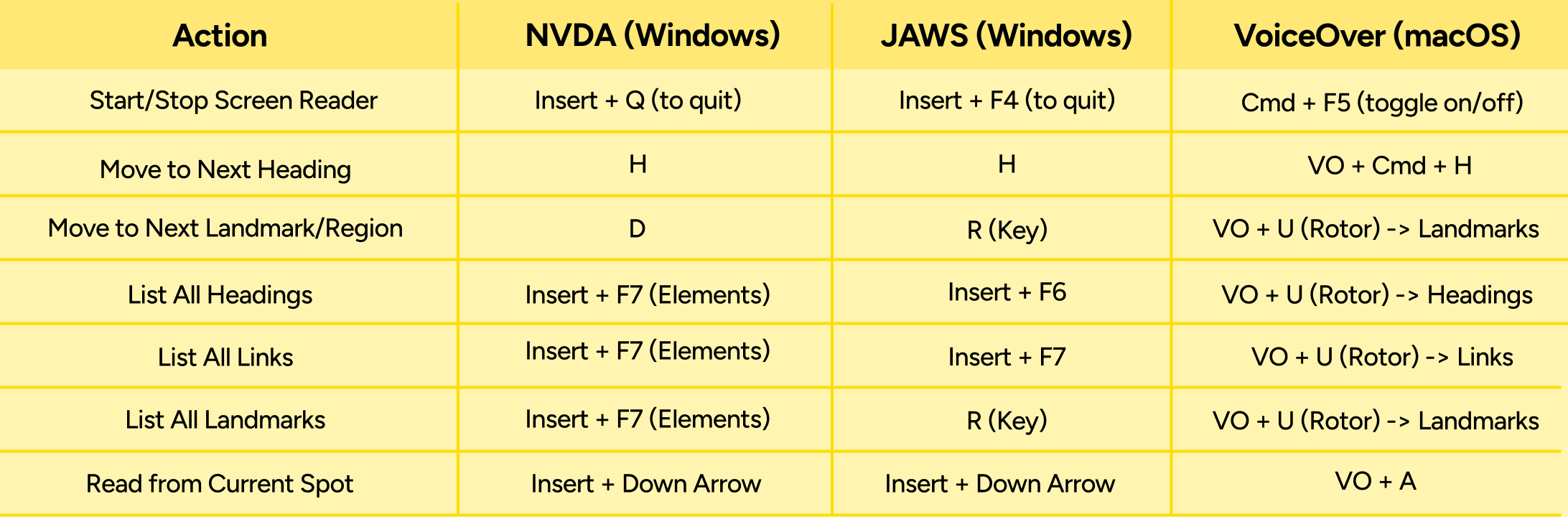
Manual testing must be supplemented with testing using real screen readers. The most common are JAWS (paid, Windows), NVDA (free, Windows), and VoiceOver (built-in, macOS/iOS)
Testers cannot simply use the Tab key. Real screen reader users navigate by structure (headings, landmarks, links). A developer testing a page must emulate this behaviour.
Closing the Loop: Statements and Feedback
Publish an Accessibility Statement: This is a W3C-recommended best practice and a legal requirement for UK public sector bodies. This statement should be linked from the footer of every page and must include:
- A commitment to accessibility.
- Conformance status: Be specific and honest (e.g., "This website is partially conformant with WCAG 2.2 Level AA.").
- Known limitations (in plain language): Do not use technical jargon.
- Bad: "SC 1.2.2 is not met."Good: "Some of our videos published before 2024 do not have captions."
- A clear feedback mechanism
- Technical details of tested browsers and assistive technologies
- Establish an Accessible Feedback Mechanism: Users are the most effective testers and will find barriers that internal teams miss. An accessible, multi-channel feedback mechanism is essential. This should include:
- An accessible web form (with minimal required fields).
- A direct email address (mailto:).
- A phone number. This feedback cannot go into a void. It must be routed through a formal process for tracking, triage, and action, creating the continuous improvement loop vital to long-term accessibility.
Conclusion: Embedding Accessibility as a Core, Continuous Practice
Conformance with WCAG 2.2 AA is not a "one-and-done" project. It is a continuous, organisation-wide practice of inclusion. The web is not static; content is added, code is refactored, and third-party tools are updated.
The goal of this four-phase methodology is not to achieve a single, "perfect" audit score, but to build a robust and mature process for identifying, remediating, and responding to accessibility barriers as they arise. As the W3C continues to work on the next generation of guidelines, WCAG 3.0, organisations that embed the principles of WCAG 2.2 into their core lifecycle now are not just ensuring compliance today; they are building a future-proof, resilient, and truly user-centric digital presence.